

Software documentation is often complex, which is not particularly surprising given the complexity of most software products.
However, software documentation should explain the ins and outs of the software product as simply and understandably as possible.
High-quality text is non-negotiable for achieving that goal, but there is a type of visual that can significantly improve comprehension and overall documentation quality—diagrams.
If you’re unsure as to why and how to use diagrams, you’re in good hands. We’ll teach you everything you need to know to get started.
Let’s start!
Choose the Right Type of Diagram
When choosing a diagram type to use in your software documentation, it’s important to know what you want to accomplish right from the start.
Do you want to explain a specific process, compare multiple sets of information, or describe a sequence and interactions? Maybe you want to map relationships or show a timeline?
There’s a type of diagram for all those needs and plenty more.
How many are there? That depends on the categorization.
For example, according to Unified Modeling Language (UML), a widely used standardized modeling language, there are 14 types of diagrams in two major groups, structure and behavior diagrams.
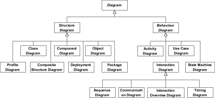
In short, structure diagrams show different objects in the system, while behavior diagrams describe how objects interact with each other.
When it comes to software documentation, three types of UML diagrams are most commonly used:
- Use case diagrams
- Class diagrams
- Sequence diagrams
For instance, if you want to show the users’ interactions with a system, you can choose a use case diagram.
It depicts the actors (or users, in the case of software documentation), certain use cases, and associations, or connections, between the users and use cases.
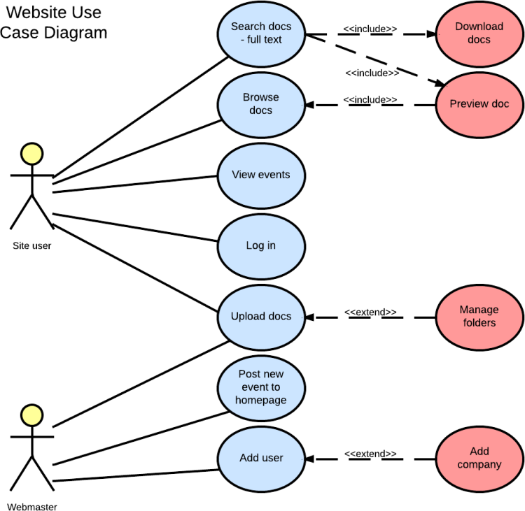
Above, you can see the site user and webmaster (actors), use cases in ellipses, and connections between them.
So, in this diagram, a site user is connected to an action of searching docs, which they can do by downloading or previewing the docs.
A class diagram is also commonly used in software documentation.
A class usually has three fields—class name at the top, class attributes below the name, and class attributions or behaviors at the bottom.
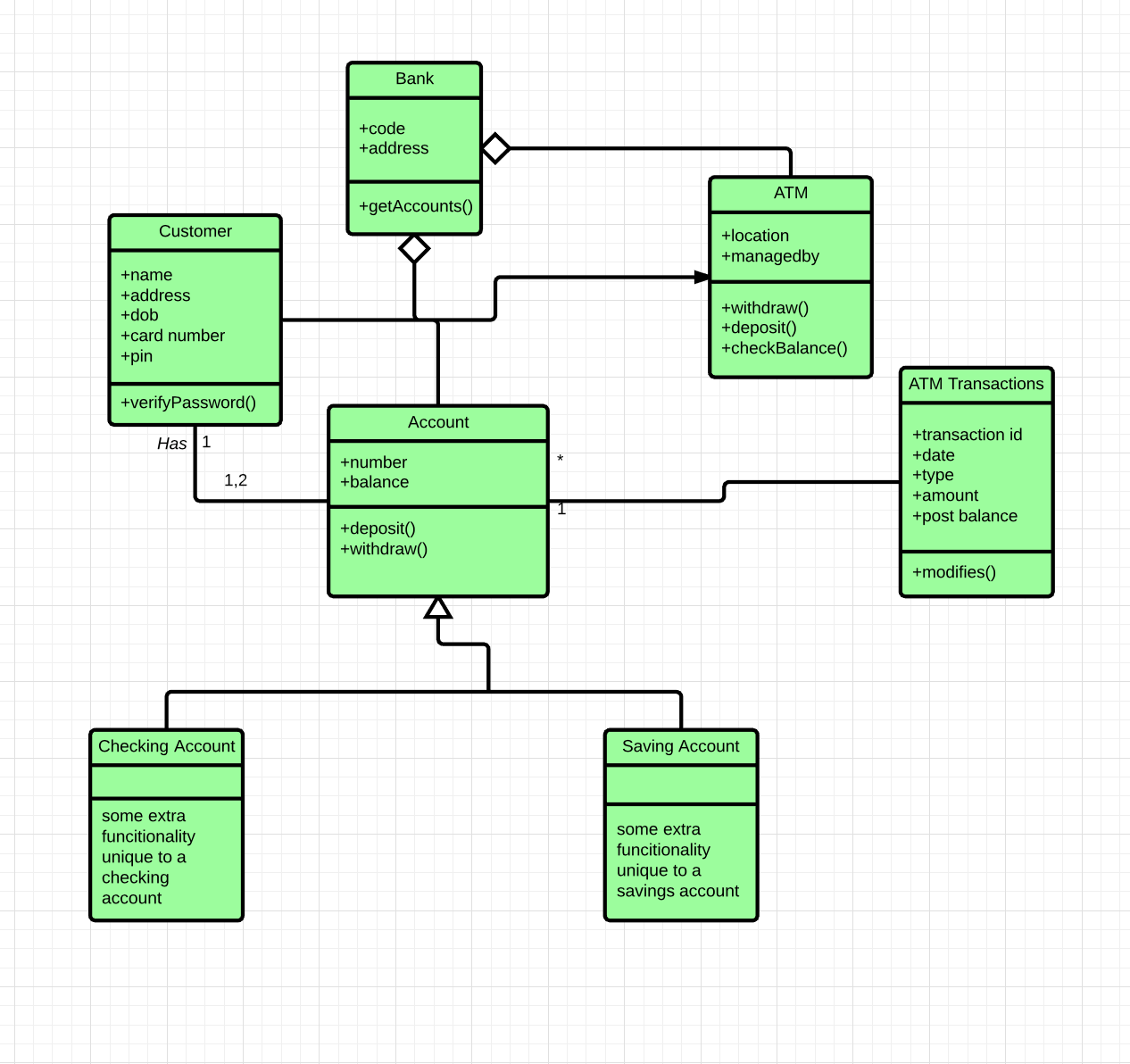
You can see that in a class diagram for a banking system above. For instance, an “Account” class has “number” and “balance” attributes and “deposit” and “withdraw” behaviors.
Also, you can track the relationships it has with other classes by following the lines.
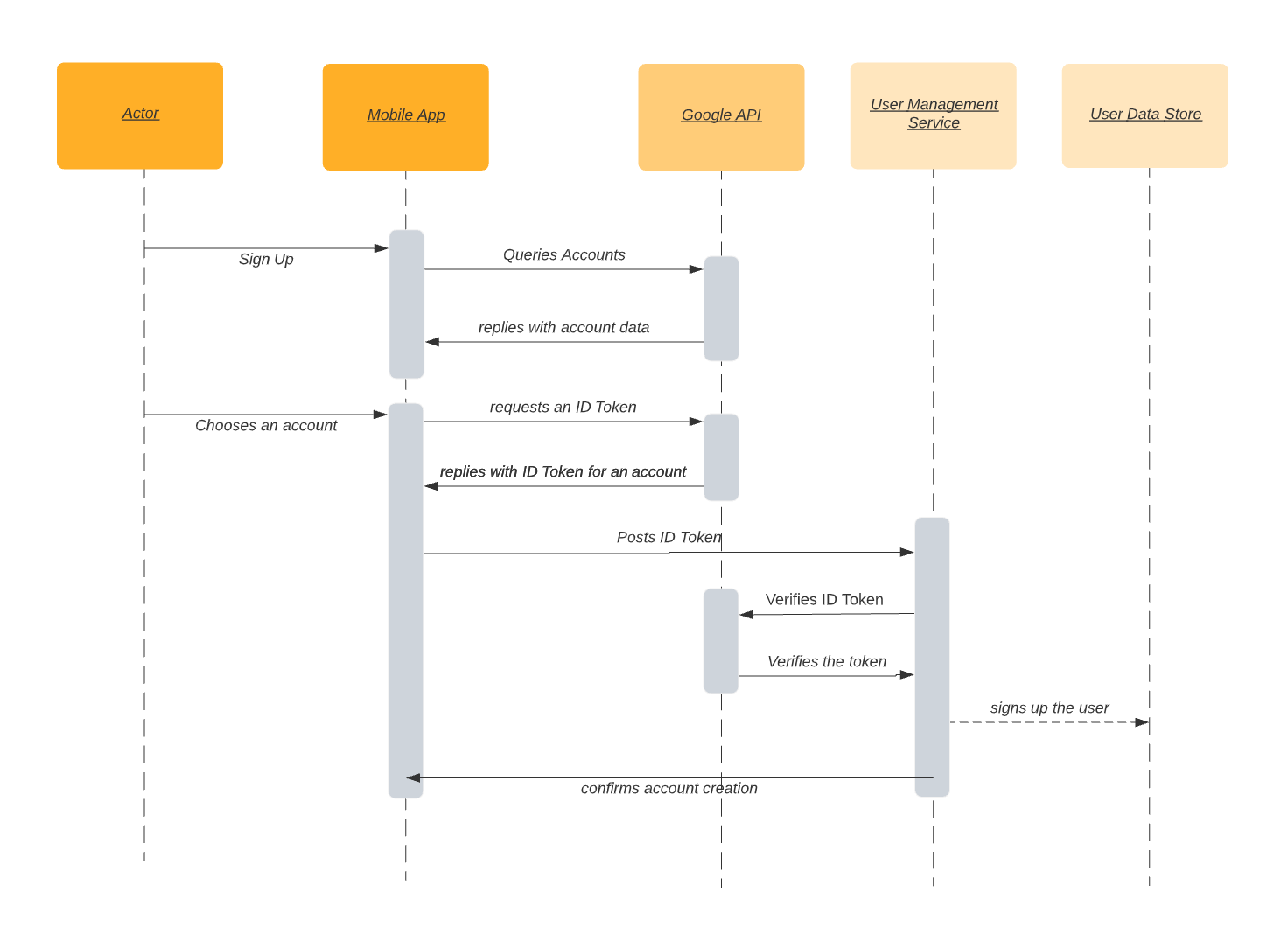
The third of the most used UML diagrams is a sequence diagram.
They show interactions in a particular scenario in chronological order.
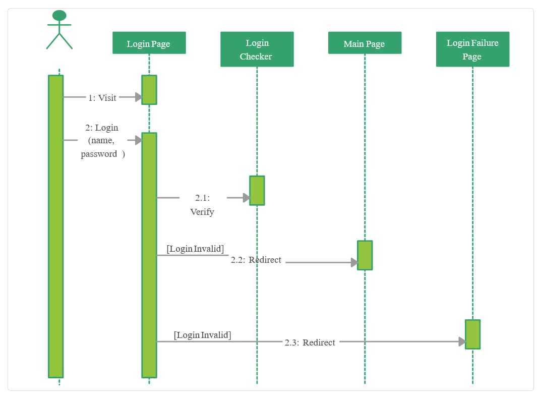
The example above shows how a login system works—what actions happen, in what order, and on which pages.
Those were only three popular UML diagrams.
As we’ve mentioned, there are many more, but there are also more outside the UML, like mind maps, Venn diagrams, or flowcharts—like the one below.

Choosing the right type for your needs can help you enrich your documentation and make concepts visually appealing and more understandable to the reader.
Format Diagrams for Readability
Diagrams can be a valuable visual tool for explaining complex concepts in your software documentation. However, for that to happen, you should know how to format them.
If you just randomly put some shapes, lines, and text together, that will most likely result in a visual mess that will only make comprehension more difficult.
Look at the two diagrams below if you need proof.
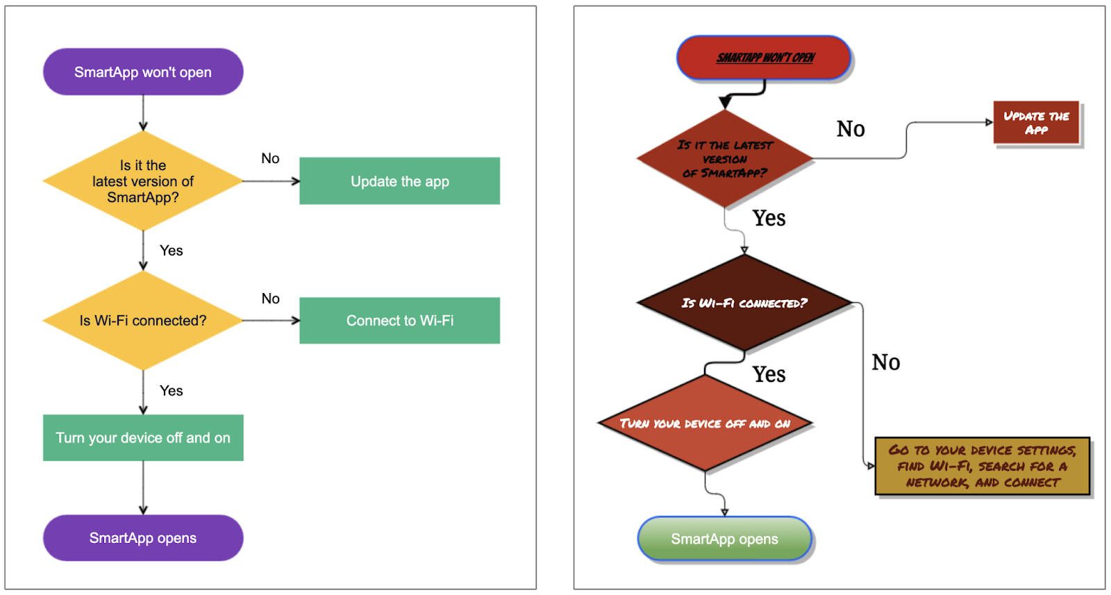
At first glance, they’re similar. On the other hand, if you observe them more closely, you’ll notice differences that make the left one much more readable than the right one.
In addition to the color scheme and the typography, which we’ll examine more in detail in the following sections, a significant difference is the design of the lines.
Straight vertical and horizontal lines make the diagram look tidy, and it’s easier for the reader to follow the connections between elements.
It’s also a common practice not to cross them, as that also makes a diagram more challenging to read.
Another difference between the above two diagrams is the amount of text.
For example, the left diagram has “Connect to Wi-Fi” written in one of the boxes, while the right has an unnecessarily long sentence for the same purpose.
For a more obvious example of how too much text can impact the readability of a diagram, take note of the example below.
Even if you could make out what it says, the question is would you want to?
A diagram with that much text serves little purpose; the same effect can be achieved by providing the reader with plain textual information.
Is there a rule for the amount of text in the diagram?
Geert Bellekens, an enterprise architect experienced in designing UML diagrams, has some advice:

In other words, if you fit your diagram on an A4 sheet of paper and the text isn’t readable, there is too much of it.
The same principle of “less is more” applies to the diagram as a whole.
You should give the elements in your diagram enough room. Surrounding them with white space will make your diagram enjoyable to the eye and readable.
Here’s how the team from Creately explains what can happen if you don’t do that:
Not giving value to space makes your diagram look cluttered, making it more confusing for the readers.
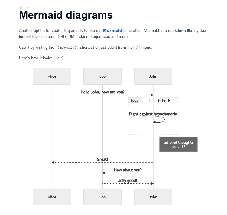
For example, the sequence diagram below is a great example of a readable and simple design.
The elements are evenly spaced and aligned, with plenty of room around them.
To sum up, following a few simple guidelines can do wonders for the readability of your diagrams.
If you format them with those rules in mind, you can efficiently convey any information to your readers.
Keep Typography in Mind
When readers of software documentation look at a diagram, they should be able to understand the information it depicts quickly.
Visual elements are crucial for that, but they’re not the only ones. The font you use in your diagrams is also essential to their legibility.
As we’ve mentioned in the previous section, simplicity is one of the principles you should follow while designing diagrams, and that stands for font choice too.
As Frank Denneman, Chief Technologist at VMware, points out, you can essentially choose between two major font families—serif and sans serif.
Sans serif fonts are simpler and, as their name suggests, can be recognized by the absence of lines at the end strokes of a letter.
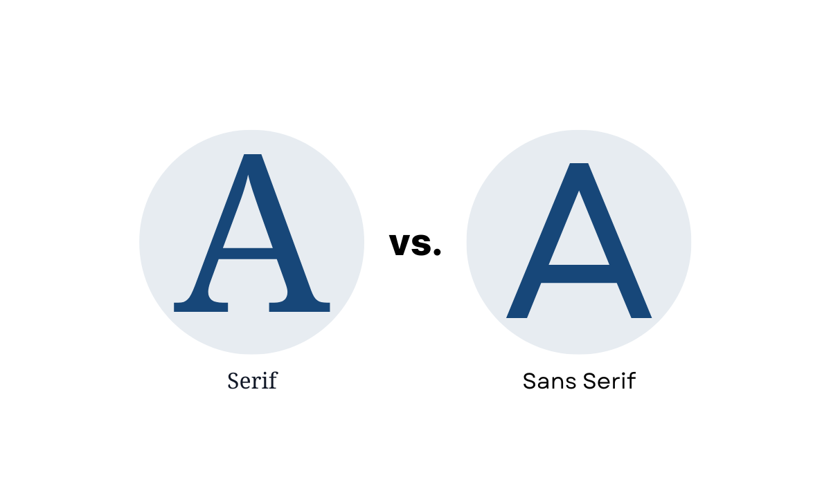
Although many serif fonts are usable for diagrams, Denneman explains that they mimic handwriting, so they’re outdated and feel more formal, whereas the sans serif fonts have a cleaner and more modern look.
Therefore, he advises using the latter in diagrams for software documentation.
Try to use sans-serif fonts when creating computer technology-related diagrams.
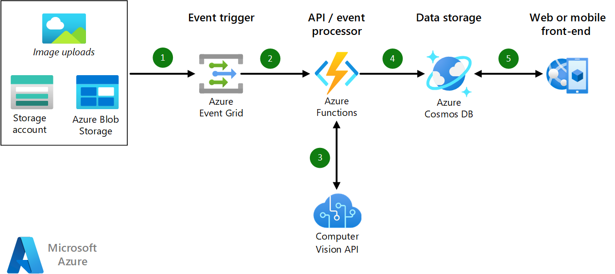
You can see what sans serif font looks like in Microsoft’s diagrams for Azure.
They use many diagrams in their documentation for Azure, which have a clean and simple font.

In addition to choosing a readable font, you can improve legibility by emphasizing certain text parts.
There are various ways to do that. You can bold words or terms in the diagram, write them in italics, underline them, use all-caps, etc.
For example, you can see what that can look like in another diagram from Microsoft.
As you can see, the text at the top of the diagram is bolded. On the left-hand side, there’s a line in italics. The rest of the text isn’t emphasized.
This is an example of using different methods of emphasizing text while staying moderate.
You should use these possibilities sparingly for a diagram to be readable and visually appealing.
Having too many style variations would make a diagram look messy, which you certainly don’t want.
Use Colors to Your Advantage
If you look at any diagram, you’ll mostly find that it consists of only a few key elements—shapes, text, and color.
Great diagrams have all of those elements meticulously planned and created. We’ve examined shapes and text. Now, let’s focus on color.
One of the crucial roles of color is that it can improve or reduce the clarity of the diagram.
That’s especially evident when you combine the color of the background with the color of the text on it.
For example, there are color combinations that result in poor legibility. Take a look at the examples below.
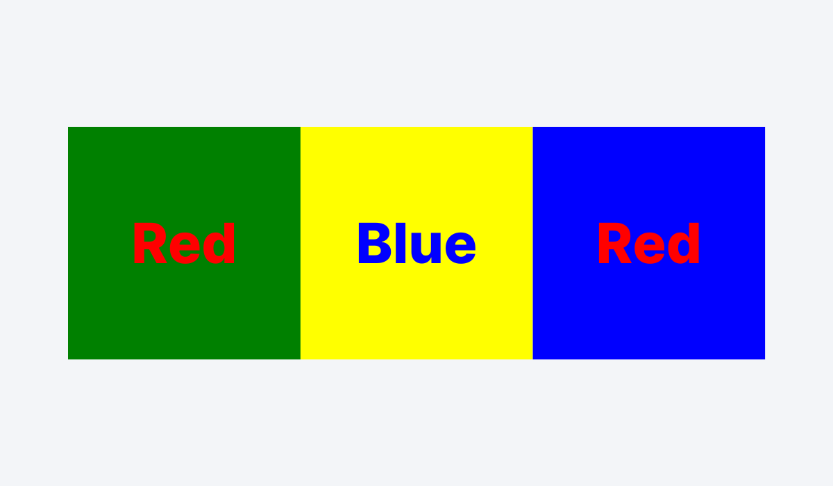
As you can see, red text on green background, blue text on yellow background, and red text on blue background are bad color combinations.
Simply put, the text is hard to read.
Therefore, you should avoid them in your diagrams. Instead, a general rule is to have black text on a light-colored background or light-colored text on backgrounds with strong colors.
In addition to impacting readability, colors in diagrams can have other purposes.
For instance, you can use them to distinguish between different categories of elements in a diagram.
Below, you can see an example of that.
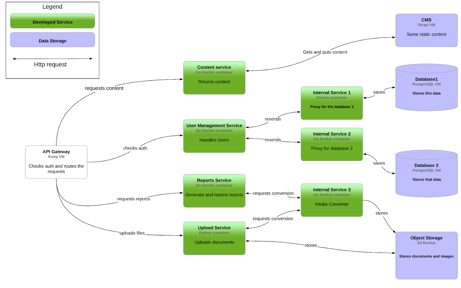
As you can see, there are shapes in three colors in the diagram.
One shape is white, a number of them are green, and some are purple. Notice the key in the top left corner; it explains the meaning of each color.
That’s one way you can use color to increase the clarity of the diagram and improve comprehension. Speaking about improvement, here are 7 tips that show you how to improve software documentation!
The groups of shapes are organized by color, so the reader can easily understand the information in the diagram.
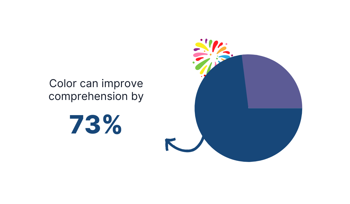
Improving comprehension with color is also supported by research. According to The Power of Color by Virginia Johnson, color can enhance comprehension by 73%.
Colors can be a powerful tool in designing great diagrams.
With the correct use of colors, you can make diagrams more legible, visually appealing, organized, and understandable.
That’s an impressive list of benefits that are worth the effort.
Use the Right Diagramming Tool
You’ll be hard-pressed to find a creator of software documentation who doesn’t think diagrams are a handy and versatile visual element.
However, whether it’s a developer, a technical writer, or someone else from the team who creates software documentation, they also know that drawing high-quality diagrams is challenging.
It takes time to find a good tool for creating diagrams, learn its interface and features, and practice using it.
And as you probably know, time is a rare commodity in the software development world. That’s why choosing the right diagramming tool is essential for efficiency.
Quick read recommendation: Why Should You Find the Time to Write Software Documentation.
There are many out there, like Diagrams.net, Excalidraw, and PlantUML, to name a few, and each has its positives and negatives.
However, Mermaid is a tool worth exploring. It lets you create diagrams using text and code. We wrote a blog post about what makes writing code documentation a challenge.
It’s a JavaScript-based tool that uses syntax inspired by Markdown to generate and modify diagrams.
Take a look at the example below.
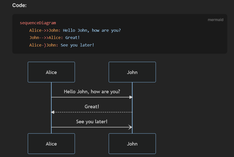
It’s a sequence diagram, one of many types of diagrams you can render with Mermaid.
As you can see, you can define elements of the diagram with code, and the tool will make a diagram out of it. It also changes the diagram as you change the code.
Using the same principles, you can create flowcharts, mind maps, Gantt charts, pie charts, etc.
Mermaid also has a live editor where you can explore various possibilities and practice. You can even download your creation and use it anywhere.
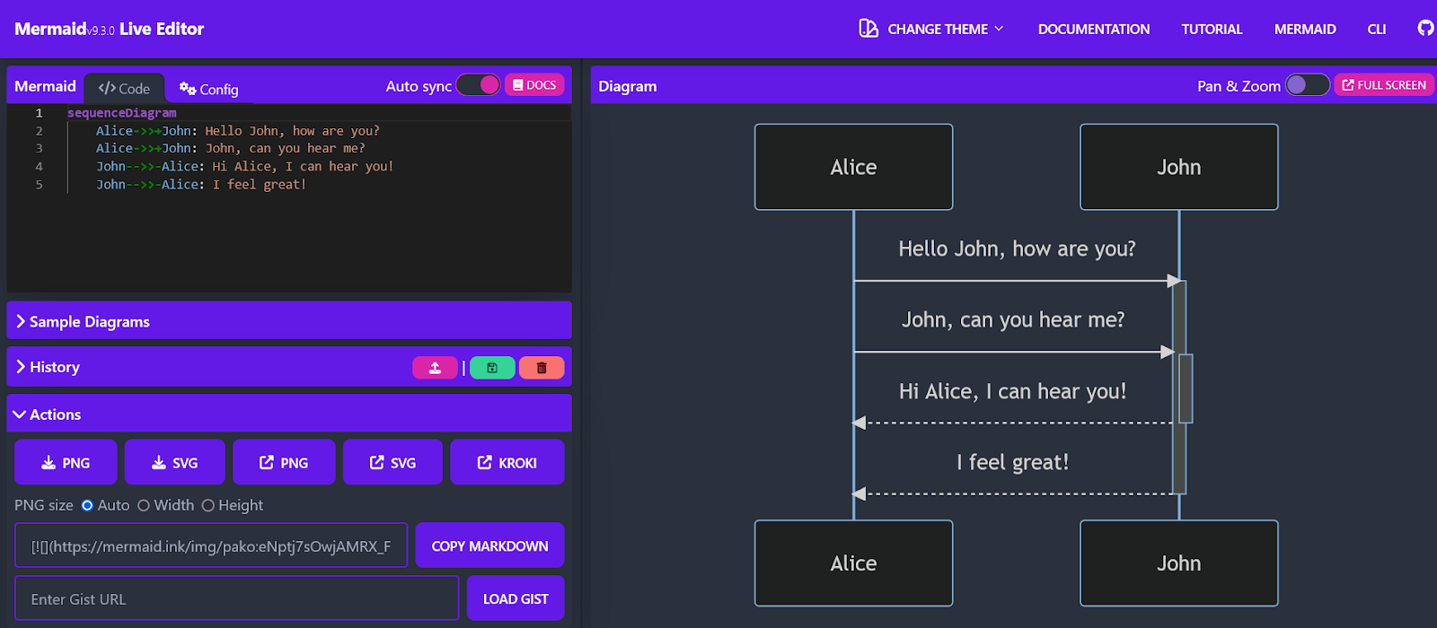
Another benefit of Mermaid is the possibility of integration with other tools.
One of those tools is Archbee, our product documentation software.
If you use Archbee for your product documentation needs, you can directly create diagrams in the documents instead of drawing them separately and uploading them.
Choosing a good diagramming tool like Mermaid can simplify your process of creating valuable and attractive diagrams.
If you master it, you can raise your documentation to another level.
Here's a complete guide to using diagrams in software documentation you should check it out after!
Conclusion
Using diagrams in software documentation can make the difference between mediocre and outstanding software documentation.
However, you have to know how to get the most out of that type of visual.
Choosing the correct type of diagram for the right purpose is essential.
Furthermore, formatting them, paying attention to typography and colors, and using a great diagramming tool are fundamentals you shouldn’t neglect.
We hope you’ll take advantage of the benefits diagrams can bring you and provide a top-notch visual experience for your users.


